via Instagram https://instagr.am/p/Cu0fP3ALO3p/
What is a snail's fury?

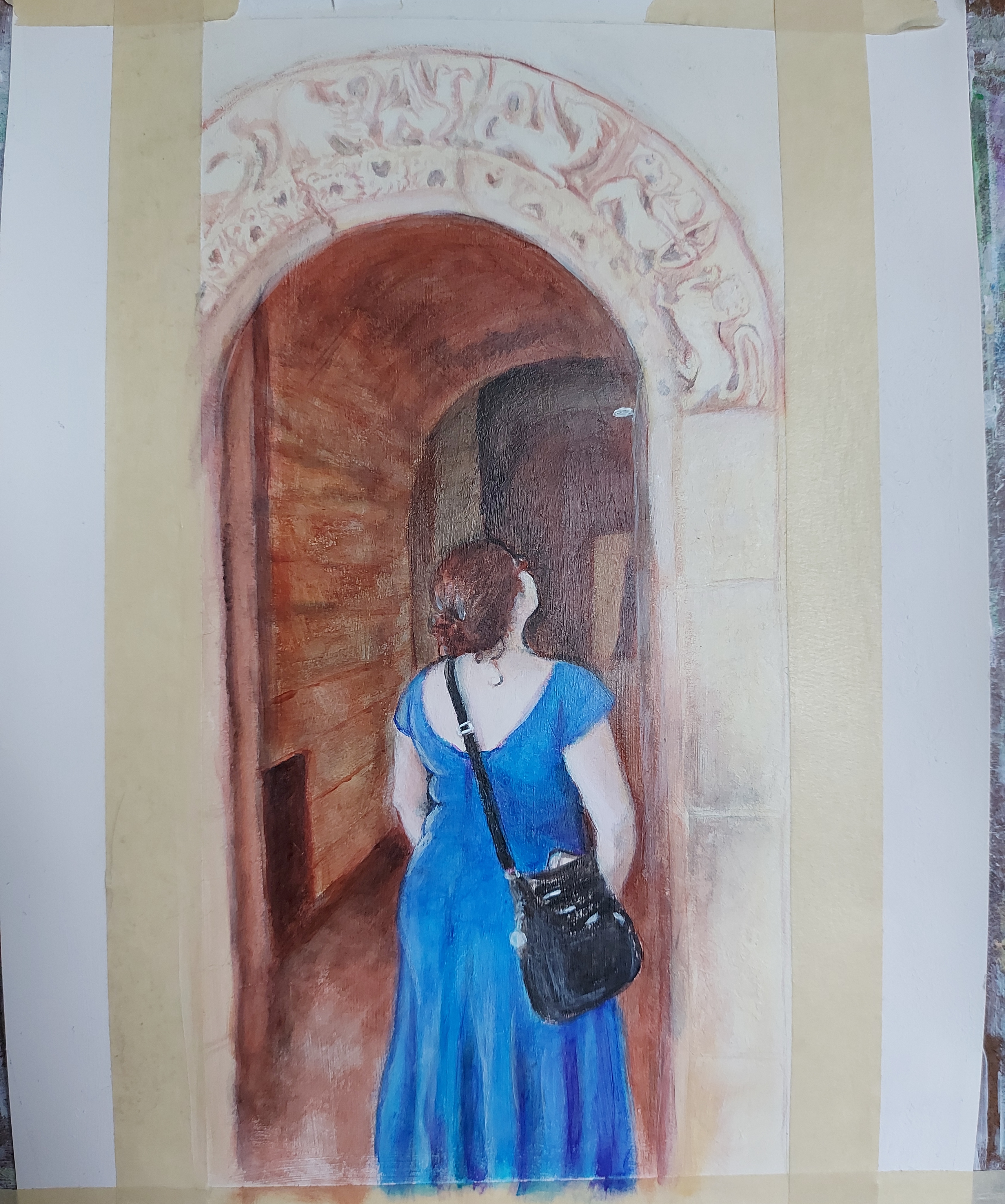

My favorite thing about this painting is the simple colour palette. I have four tubes of paint out–and in retrospect, I think I could have skipped using the turquoise on the siding.
So far, I’ve used only a smidge of white (to match shade while correcting errors), and no black at all. I’d like it to pop a little more, which I think means I need to do more opaque and semi-opaque layers to contrast with the underlying blue…What do you think?